1st Submission Logos
When doing the logos for my client, I wanted a clever play on words. Estate sales are all about the discovery, hence the name but I always think of a (retro) lightbulb going off, or playing on the feel of “retro explorer” the underused monocle design. I wanted a fun, retro but modern vibe to the logo. I sent my client these following 6 variations, in color and black and white to choose from to refine.


Final Logo and Icon Designs

Finalized Logo Design

Finalized Icon Design.

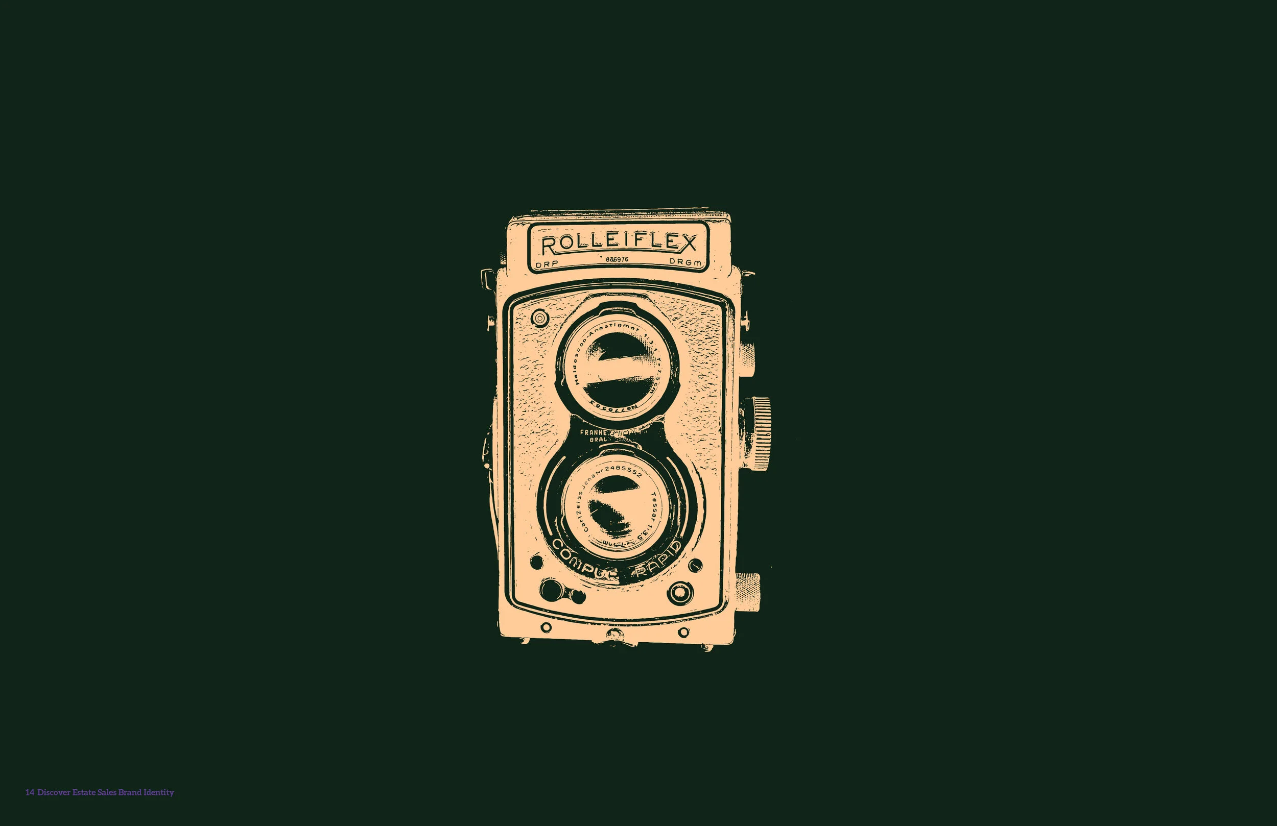
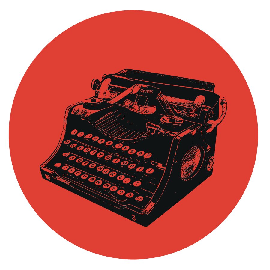
Brand Identity
Once the logo was chosen, I was able to refine it with my clients needs, and create a brand identity for them. I utilized the yellow in the logo beams, as a prominent color in the brand. The following are the brand guide pages sent to the client for review. As with any brand it is important to establish a consistency early on, and the muted yellow with the almost black are consistent through out, with pops of color.

Brand Guide sent to client.